Moore Stephens branding
Art Direction & Design
Background
Moore Stephens had been operating with the same brand identity since 1986, nearly four decades without a refresh. Every department designed its own materials independently, resulting in a fragmented visual identity: mismatched fonts, inconsistent layouts, and clashing colour palettes across all printed and digital communications.
Solution
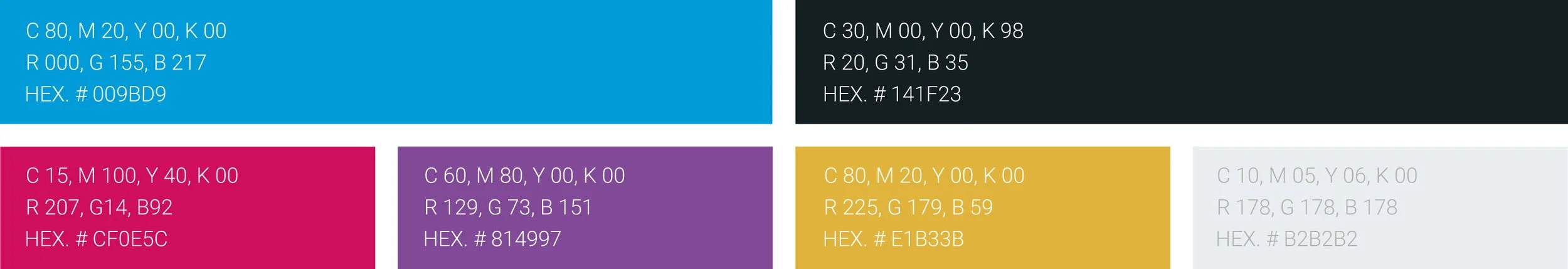
A full rebrand across every touchpoint — digital and print. New typography, a cohesive colour system, refreshed imagery, and modernised layouts replaced the patchwork of ad-hoc designs. The goal: bring Moore Stephens decisively into the present with a confident, contemporary identity.
All internal communications were standardised through professionally designed Word and PowerPoint templates, giving staff a consistent toolkit and eliminating the guesswork that had driven years of brand drift.
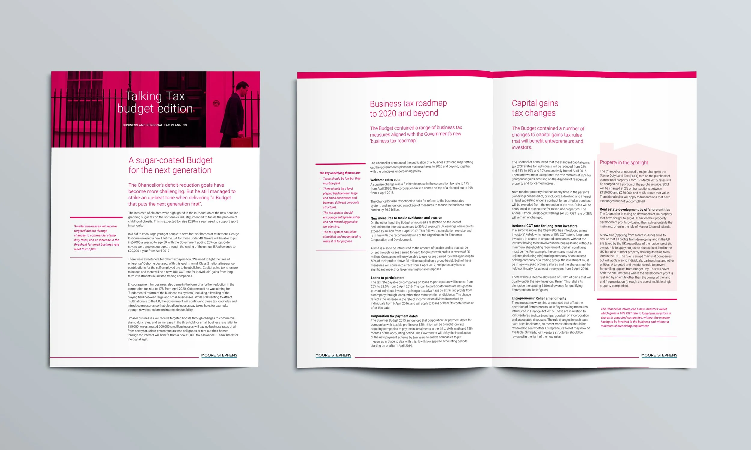
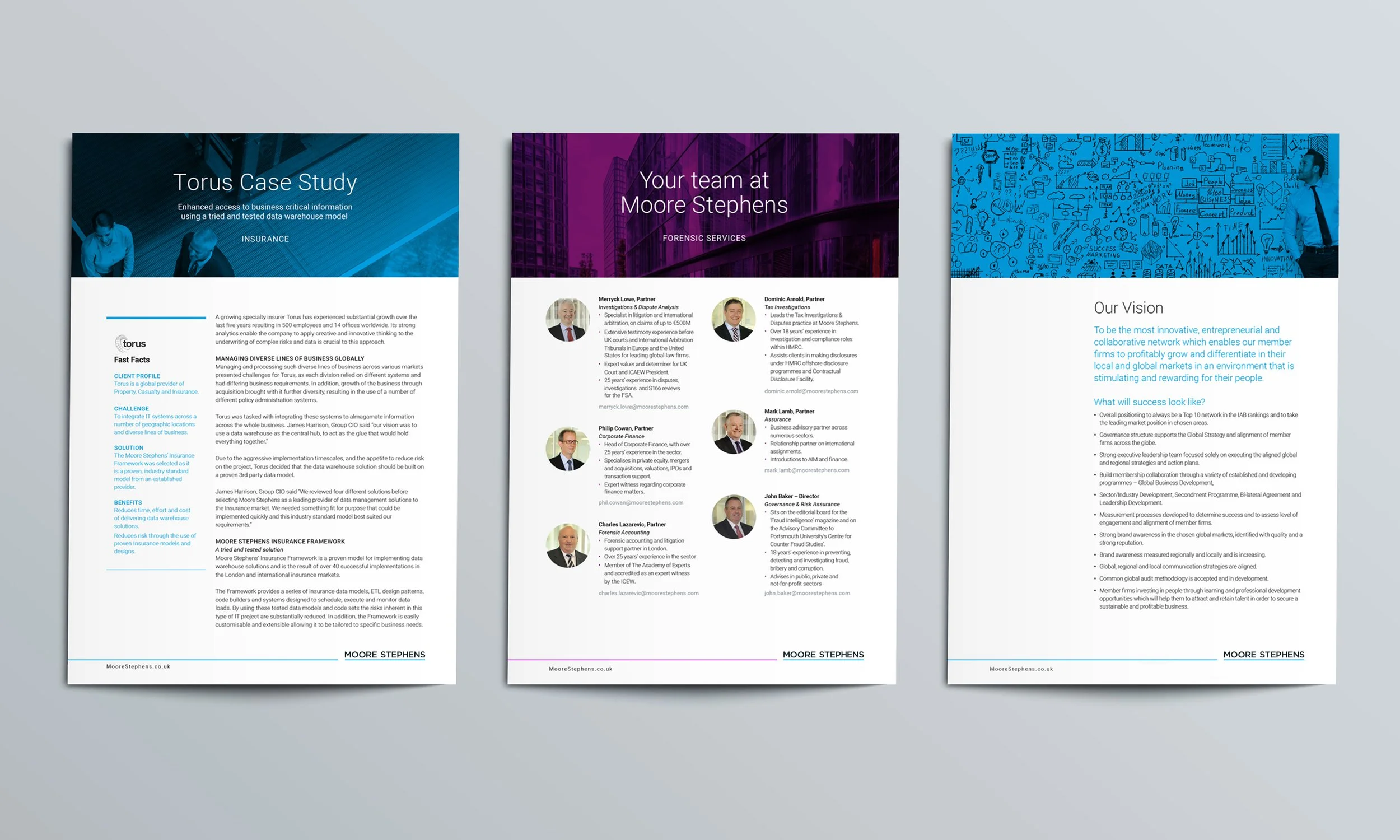
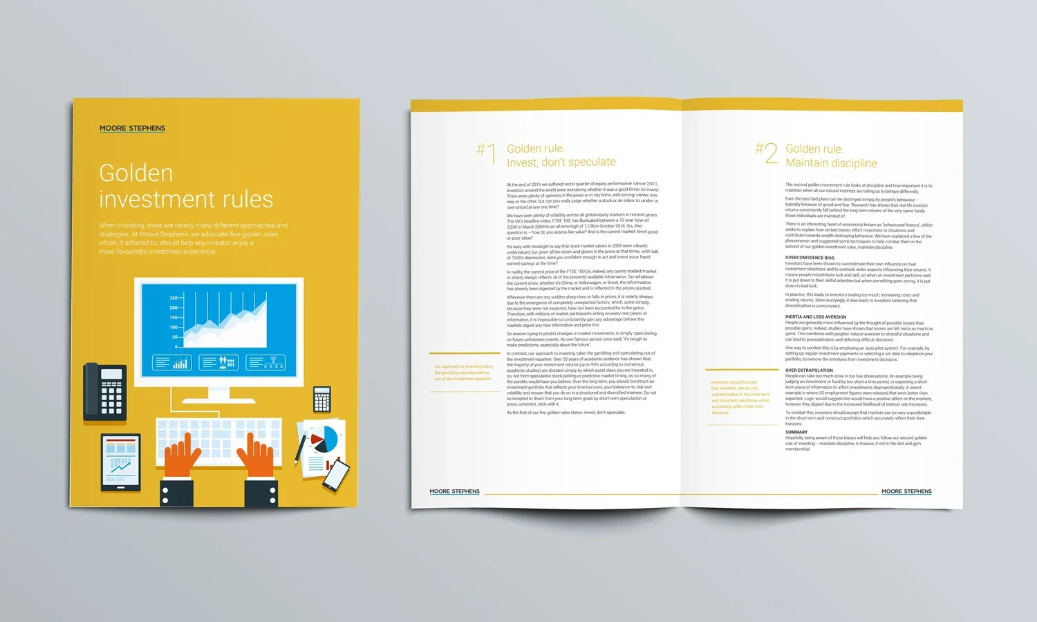
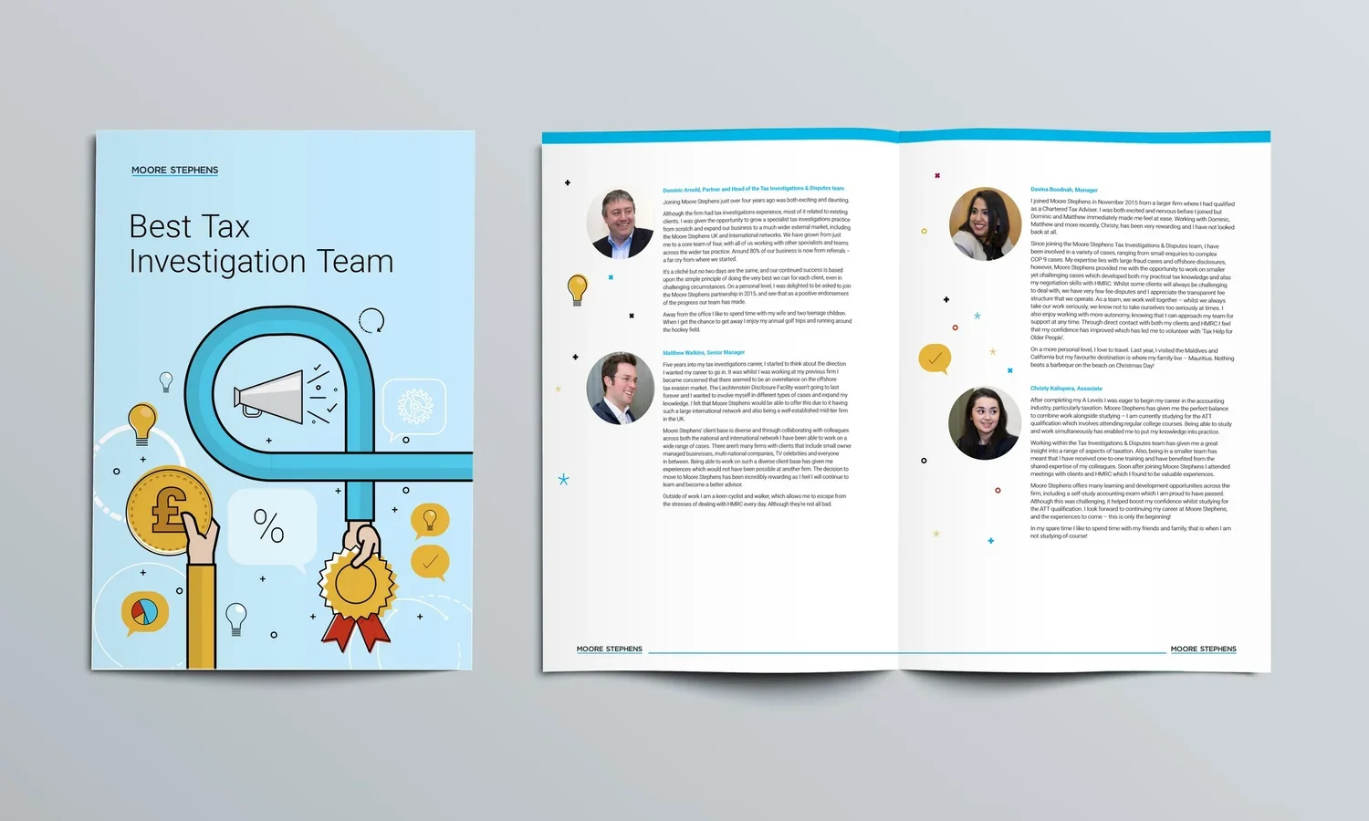
Branded materials
Brochures, Newsletters and documents were designed by the on-site design studio. Word templates were designed for Partners.
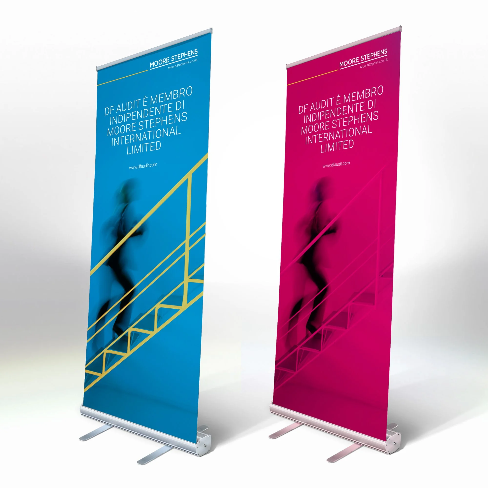
Pull-up banners
Branded OOH tactics were designed to have instant visibility
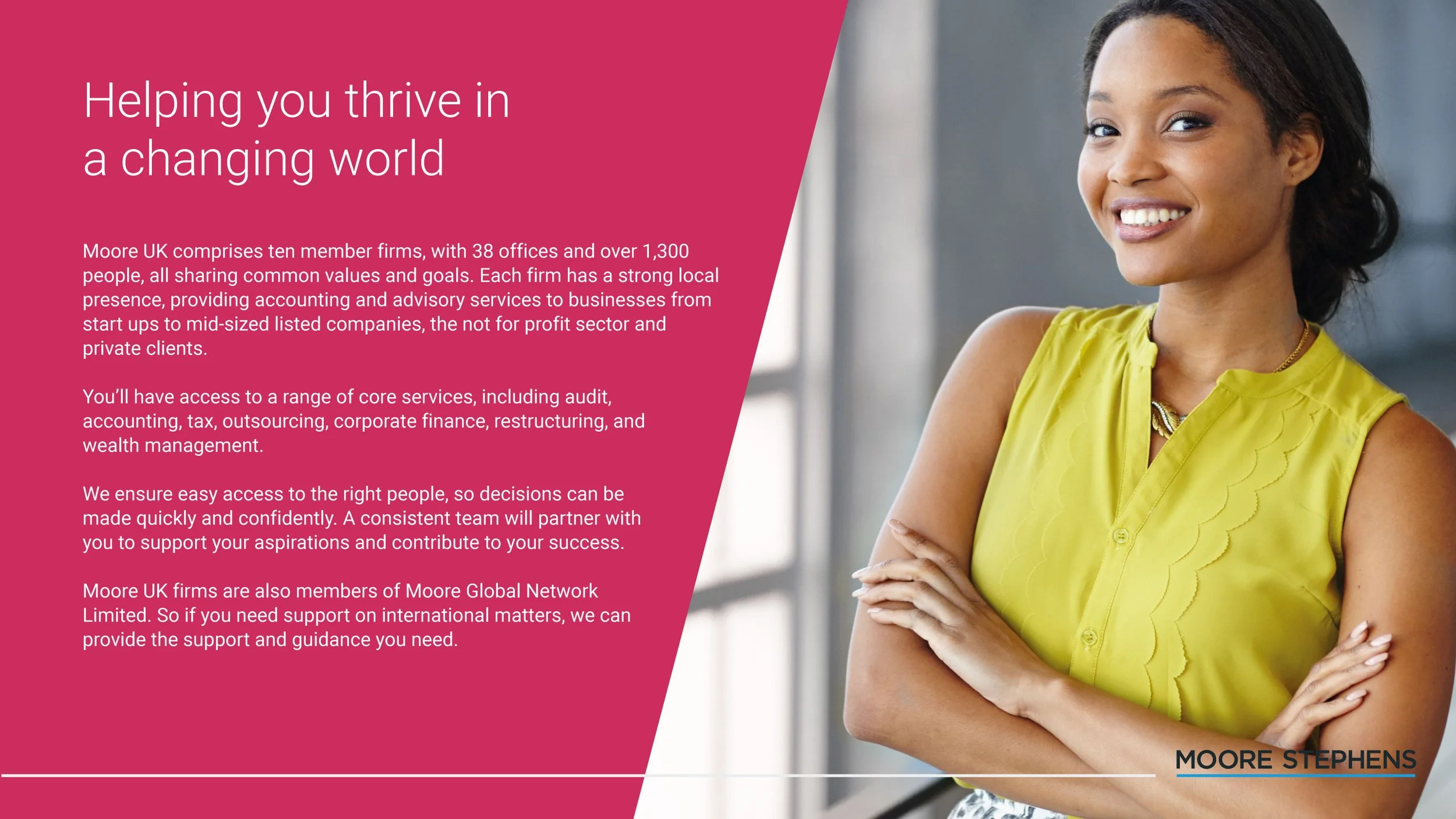
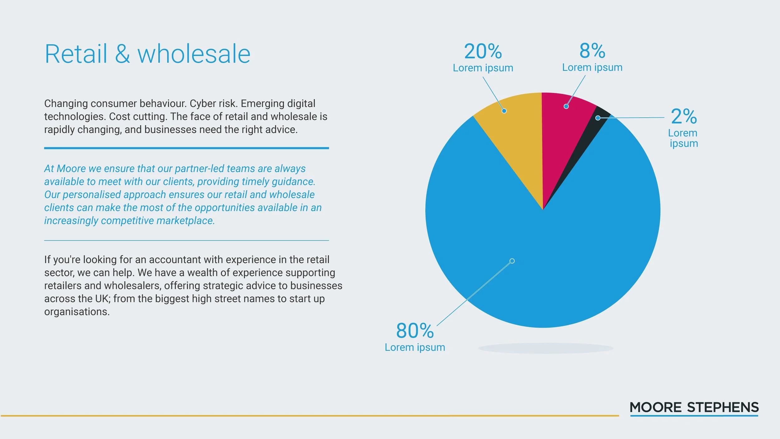
Powerpoint templates
The use of animation, colours and imagery helped keep client presentations engaging