Pinksheep rebrand
Design & rebrand
Background
Pinksheep are not your average supplier. They are the kind of company that global brands call when they want branded merchandise and print done properly, on time, on brand, and without the back-and-forth that eats up everyone's day. Their systems are built to streamline. Their people are built to connect. And their results are the kind that make clients look good in rooms they really needed to look good in.
But none of that was coming through clearly enough. The brand had the substance. It just needed the surface to match.
Solution
Before a single concept was sketched, the work began with listening.
Questionnaires went out to understand not just what Pinksheep did, but who they genuinely were, how they spoke, how they worked, what they valued, and where they believed they were headed. The answers painted a picture of a company that was warm, direct, and quietly brilliant at what it did. Fun without being frivolous. Professional without being stiff. The kind of team clients actually enjoy working with.
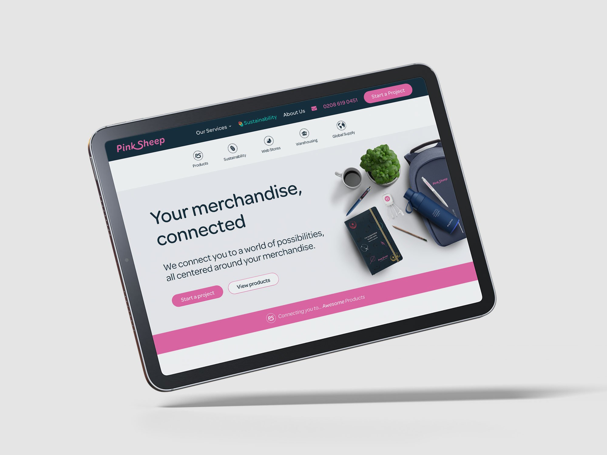
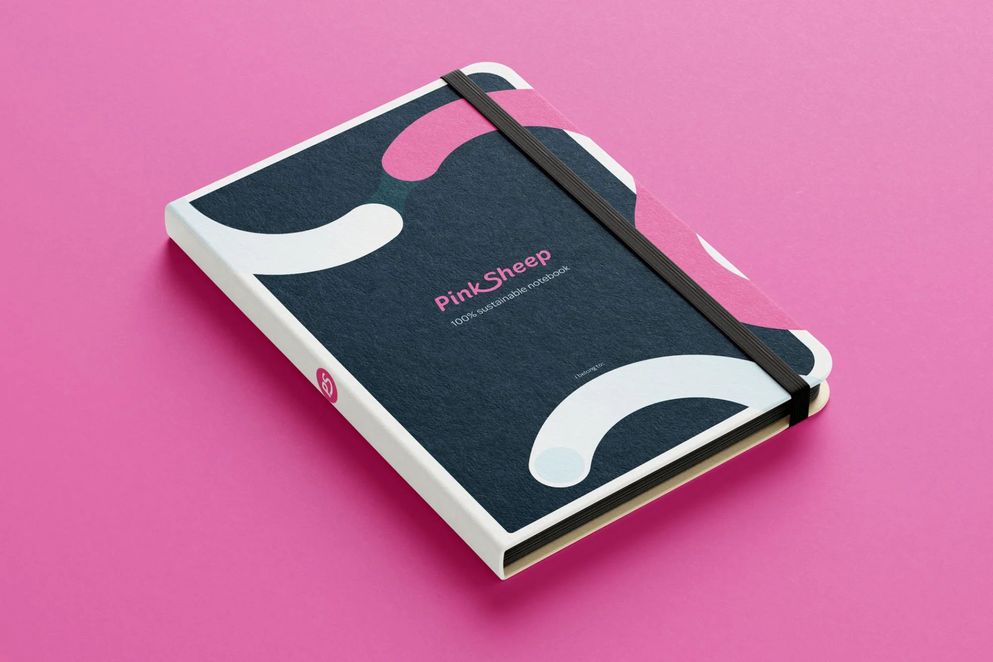
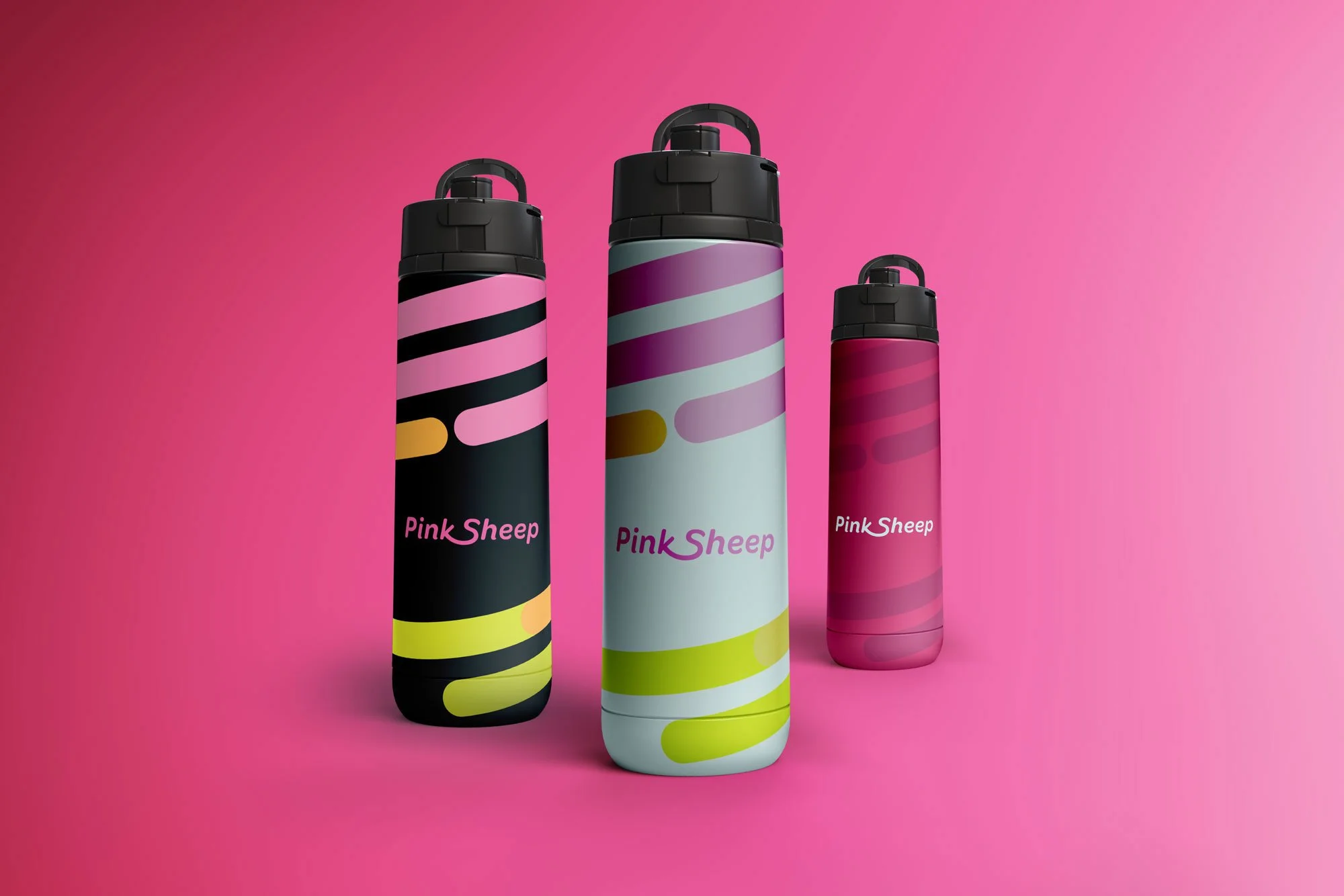
Three pillars emerged and were signed off as the creative foundation: fun, freshness, and connection. Not as adjectives pinned to a mood board, but as genuine expressions of how Pinksheep already operated, just waiting to be made visible.
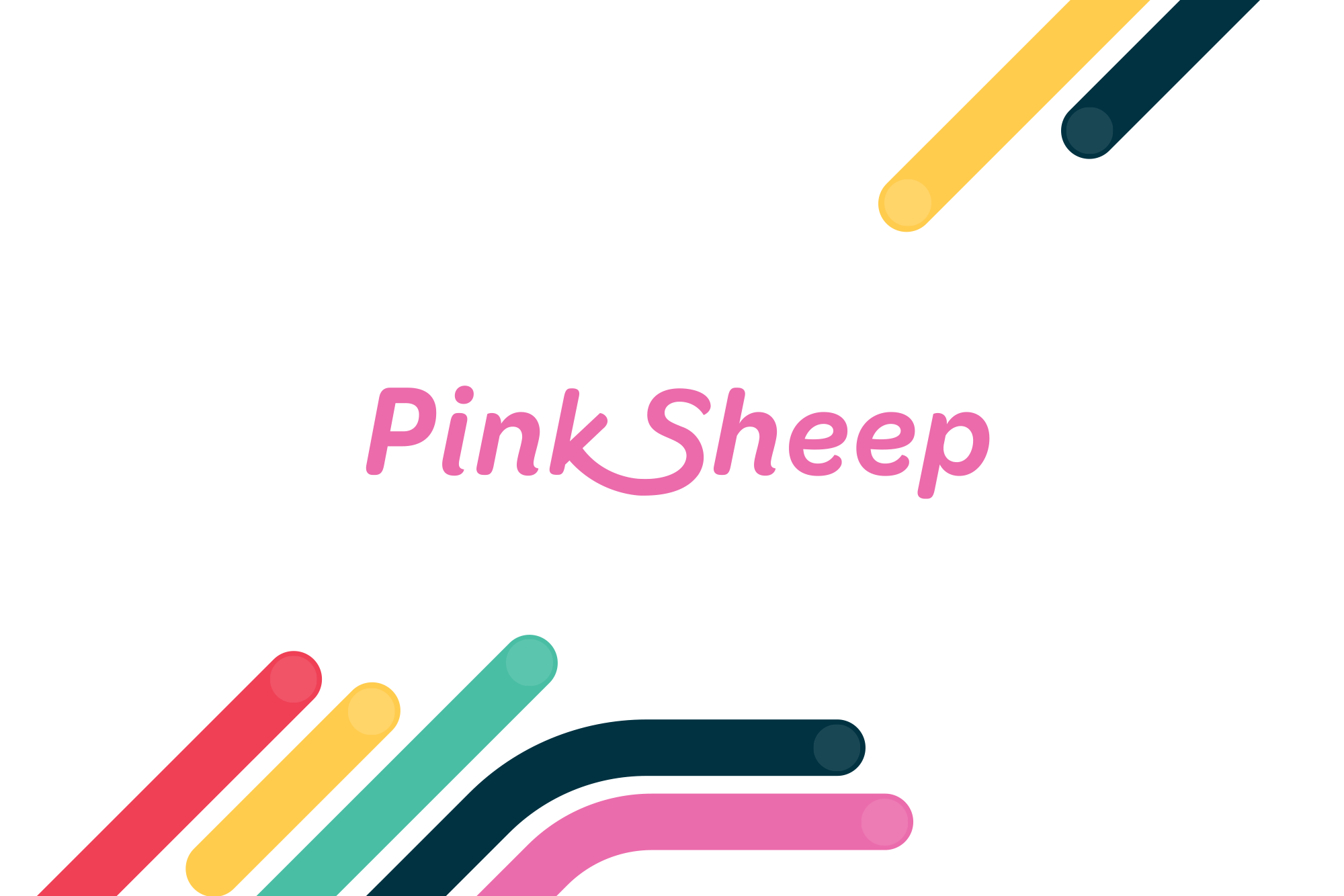
And then there was the sheep.
The previous logo carried it. The new direction didn't need it. Pinksheep the company had long outgrown the literal interpretation of its own name, it was time the brand caught up. What replaced it was something bolder, more confident, and more true to a business that had earned the right to stand on its own identity.
The sheep was gone. The personality was just getting started.